(How could this be explored further?)
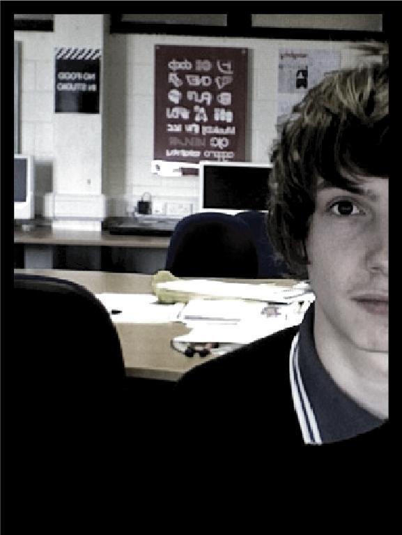
Well I've chosen an approiate typeface to communicate sentimental (Bodoni) which also suggests that Tom is laid back.I could ask more questions and get more personal with Tom so it communicates his personallity cause at the moment I feel like I'm letting my personallity bleed in and I dont want that to happen.
Why is the existing typeface that has been selected to manipulate an inappropiate/Appropiate choice?
Bodni-It was an appropiate choice because It has delicate serifs and some parts of the typeface are thin and delicate.One of the words chosen were sentimental.And the definition I would give "Sentimental" is something which is emotionally delicate.So with this in mind I think bodoni is an appropiate typeface in that aspect.Another word selected was Laid back.Although at first glance bodoni could look like a serious,formal and a delicate font it also holds laid back properties.The lower case "g" has a very fluid,open loop.Also the link on the g starts out quite thin and gets fatter leading towards the loop.This gives Bodoni the laid back quality Im looking for.Its fluid,Open loops,and rounded terminals.
What are the reasons behind the design decisions you have made for the typeface so far?
By adding more curves and bigger loops and maybe even making the typeface italic it could communicate laid back.But contrasting with sentimental I manilpulate the shoulders and make them thinner.
Actions to be taken?
- Ask more questions-dive deeper into Toms personallity.
- Trial and error-Play alot more with the type and dont be afraid to make mistakes
- More research on the type itself.

No comments:
Post a Comment